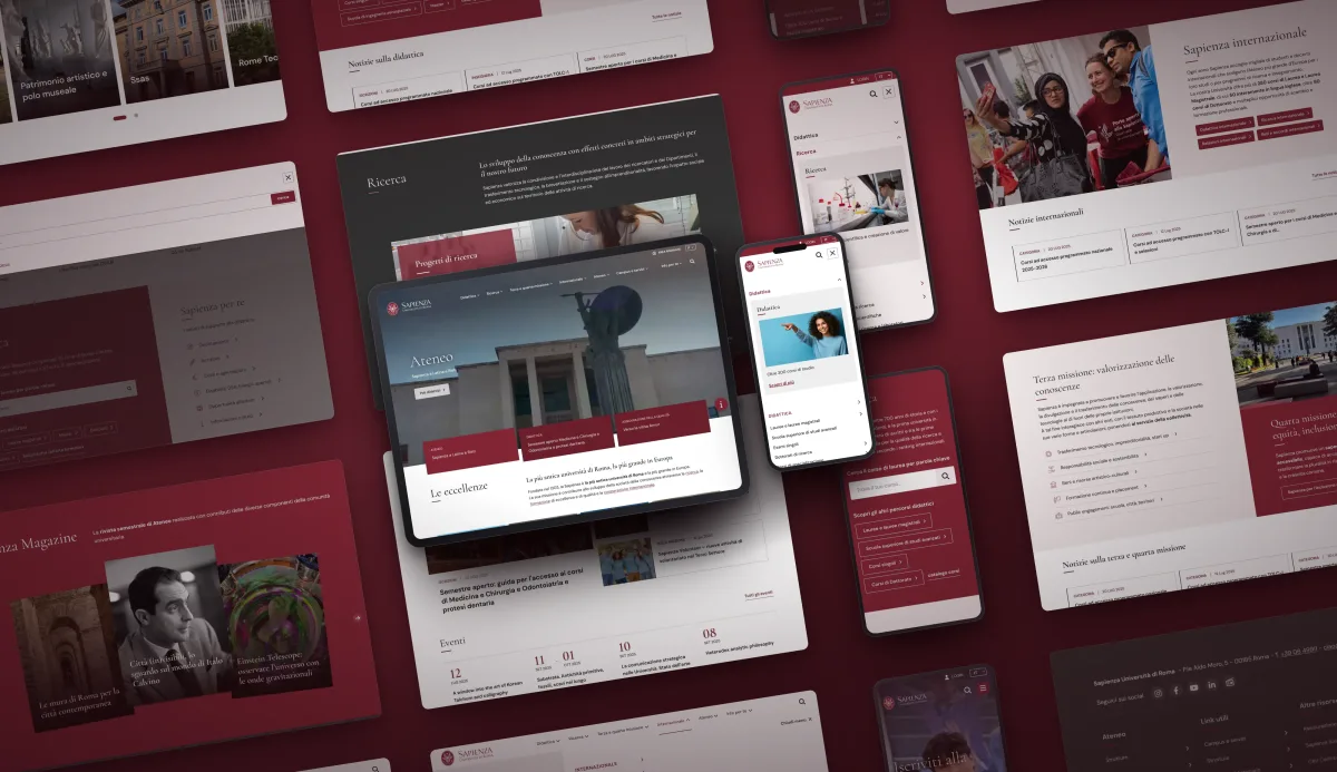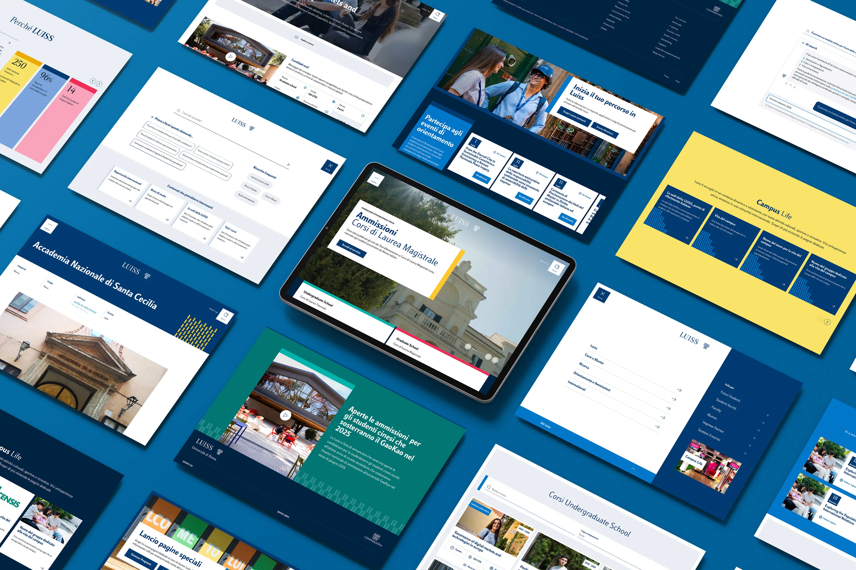
Luiss rebuilds its digital presence as an ecosystem: multibrand design system, Drupal and search with agentic AI.
−70% in content publishing time
Documented foundations: color palette, typography, spacing, grids, tone of voice. Foundations first, then the first page, then the guidelines for the future website.
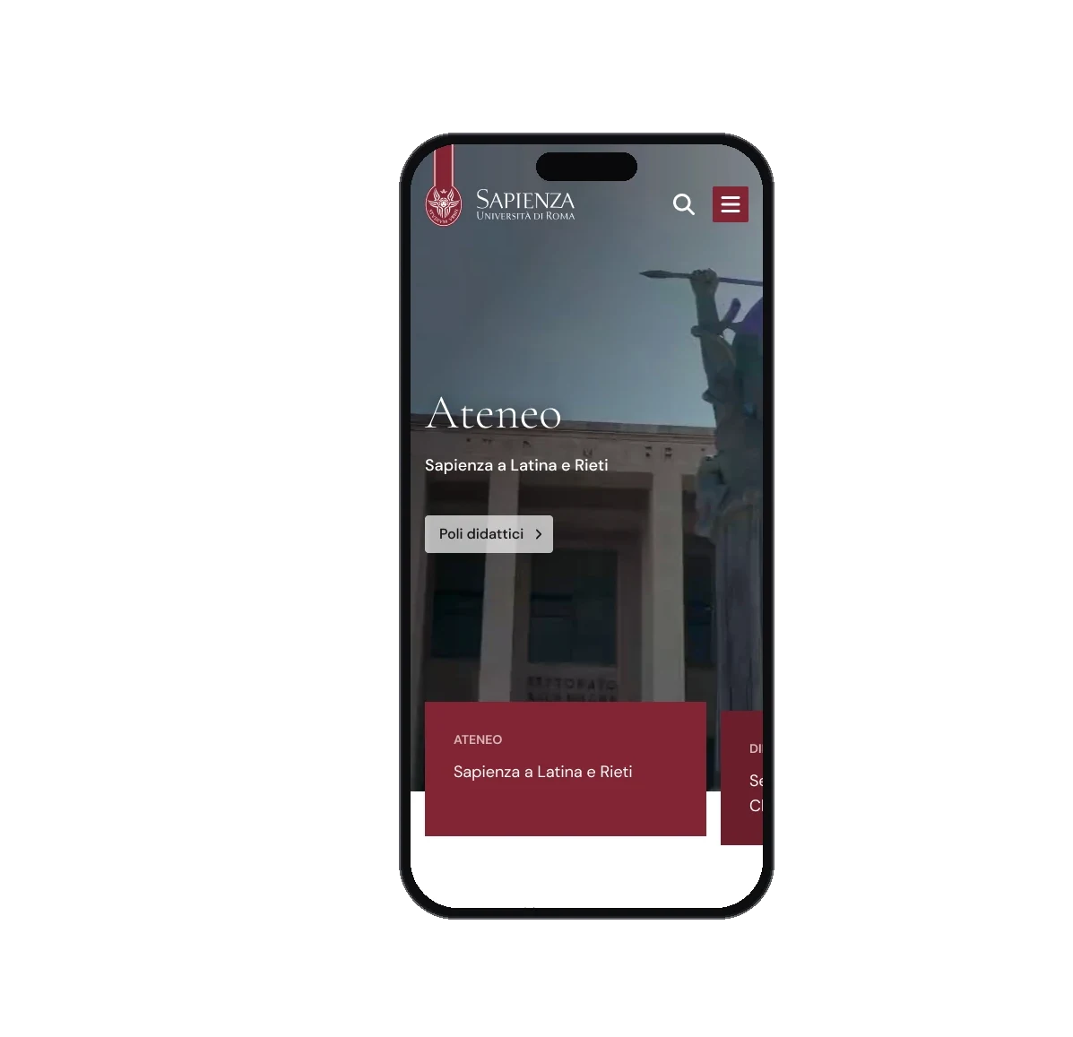
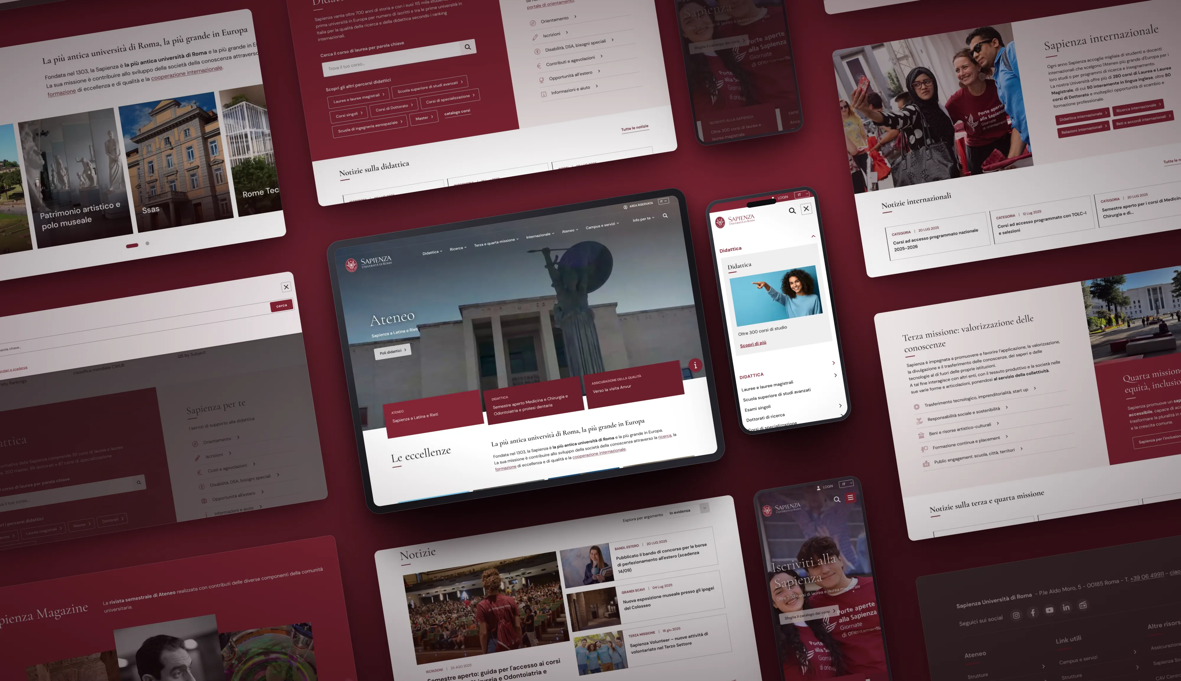
Sapienza University of Rome is Europe’s largest university by number of enrolled students: 11 faculties, 58 departments, plus research centers and sites across the territory. uniroma1.it is its main digital point of contact.
On the other side of the screen there is an vast and diversified audience: Italian and international students, families, academic and administrative staff, media and the scientific community.
The previous homepage, running on Drupal 7 for years, struggled to communicate Sapienza’s identity. At its core was a mosaic of news items and boxes that put everything on the same level. Users ended up relying on external search engines rather than on the site’s own navigation.
Designing the main page and the menu, however, had to account for a deeper constraint: the site’s dual nature. Two different needs, often competing for the same space: the first screen of the homepage.
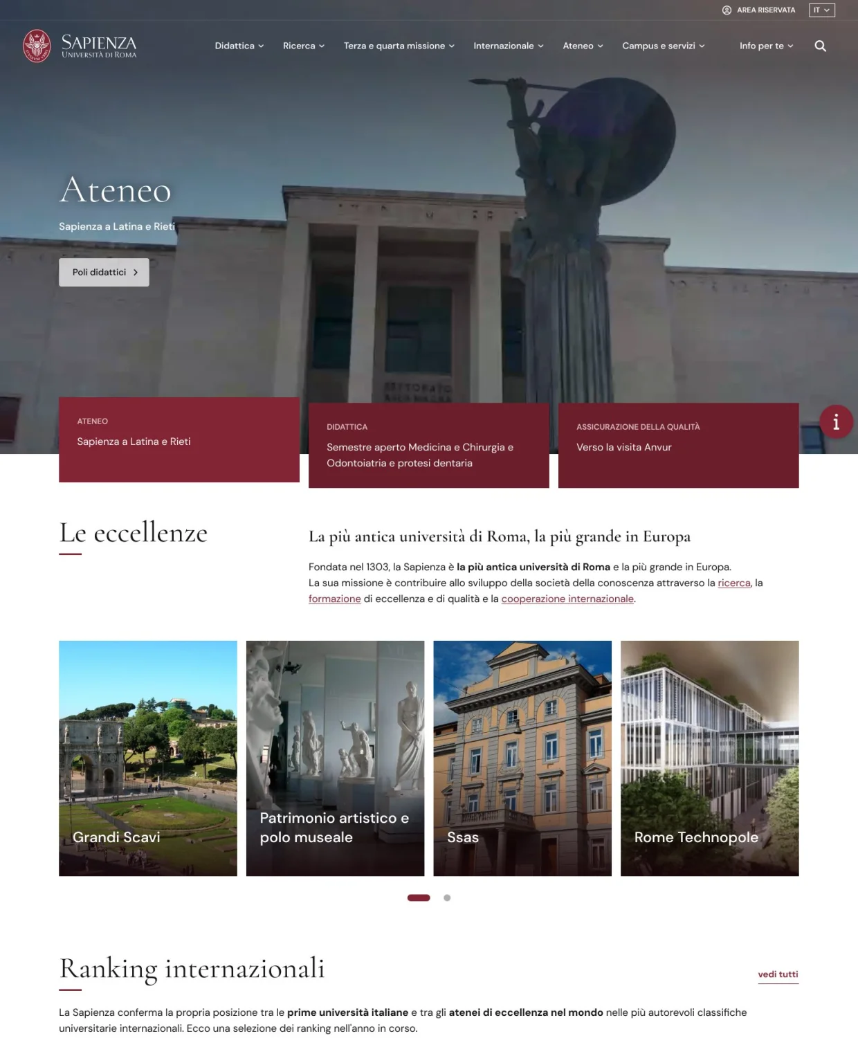
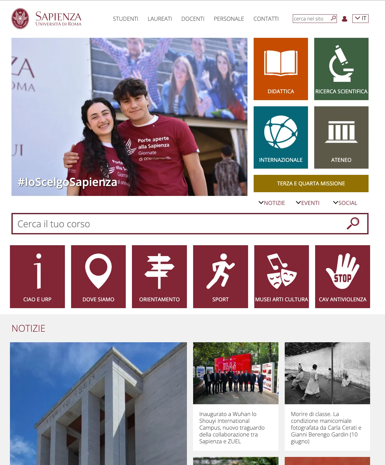
Drag to compare · from mosaic to bands
The starting point was a qualitative analysis of the site’s audience: telling primary targets from secondary ones, each with its own needs and its own language.
It is from this map that the homepage hierarchy comes: what deserves the first screen, and what can wait.
The deliverable of the project is not the homepage: it is the design system foundations that make it possible. Color palette, typography, spacing, grids, tone of voice and accessibility, defined once, in a single place, and valid for everything that comes after.
The homepage is the first thing built with that system, not its purpose.
Foundations · Sapienza
One base, different pages
For a university of this breadth the difference is substantial. Without shared foundations, every page that follows starts from scratch: new decisions on color, new measurements, a new tone, and a consistency that frays as the future site grows.
With foundations in place, whoever designs the next sections starts from a vocabulary that already exists and discusses content, not pixels. This is why the work on the first page was set up as work on the system, and not as the restyling of a single screen.
The design system foundations are defined and documented as a shared base for the whole future university website, not only for the page that brought them to life.
The palette starts from the institutional Sapienza Red and works it into a full scale, so that the accent stays recognizable even where contrast, depth or a soft background is needed. The type pairing holds the two sides of the university together: a serif for the authority of headings, a neutral, highly legible sans for body copy and interface.
Tone of voice is the least visible foundation and perhaps the most useful: the new homepage was the occasion to build on the language review the university is carrying out, starting with the reconfiguration of menus and navigation paths. And digital accessibility is not a final check but a design constraint: every component was designed with it in mind from the start.

Designing the homepage of a university like Sapienza means deciding what comes first. Doing that required shared foundations: without them, every page that follows would start over from scratch.

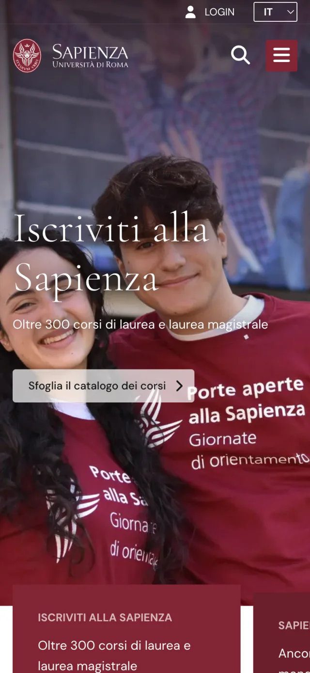
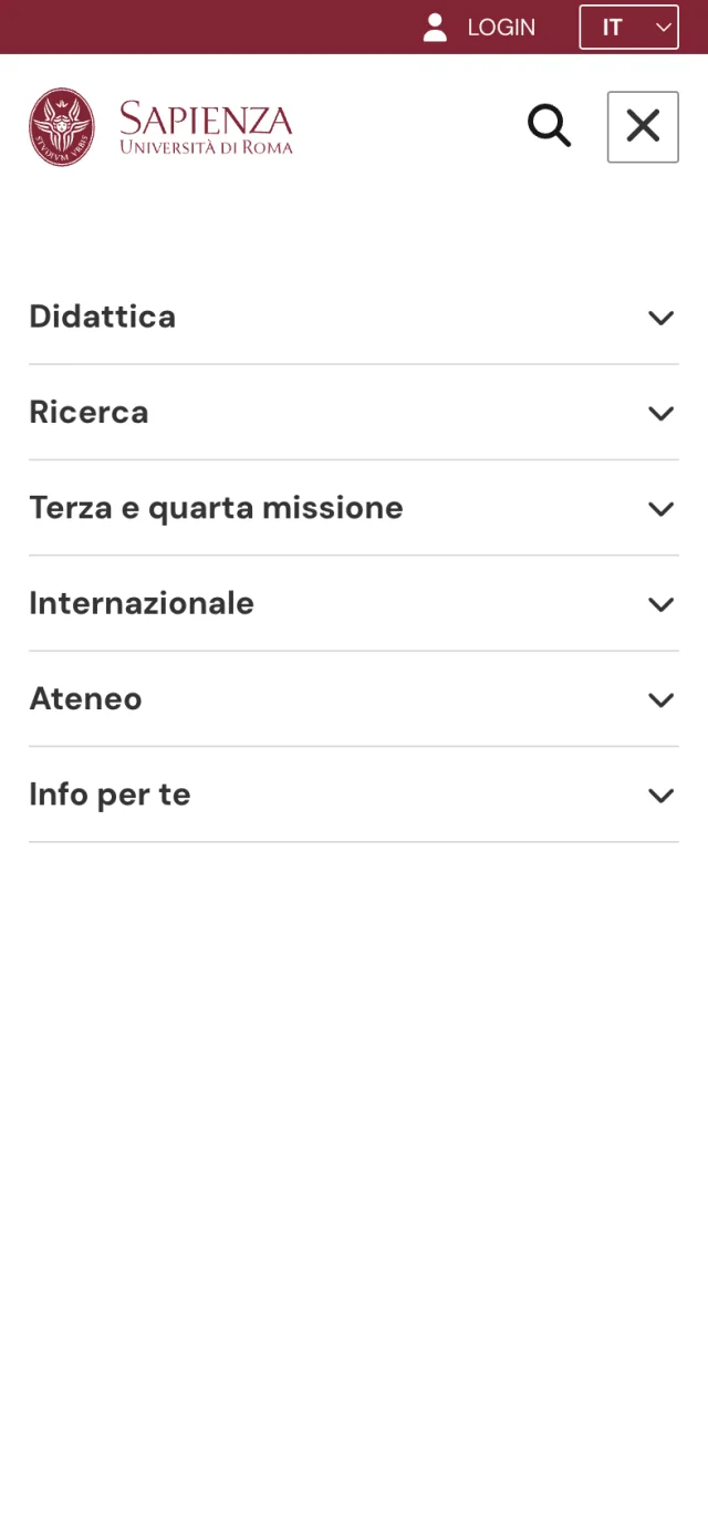
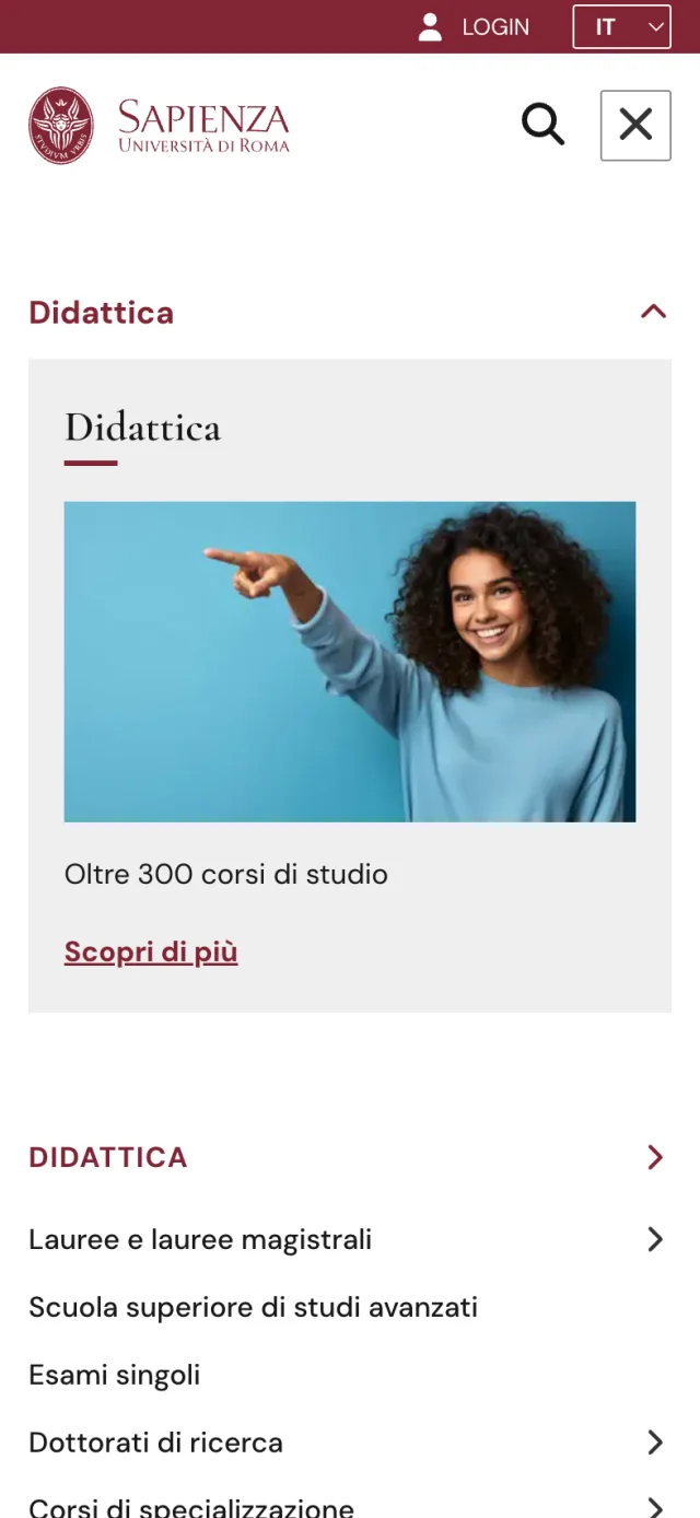

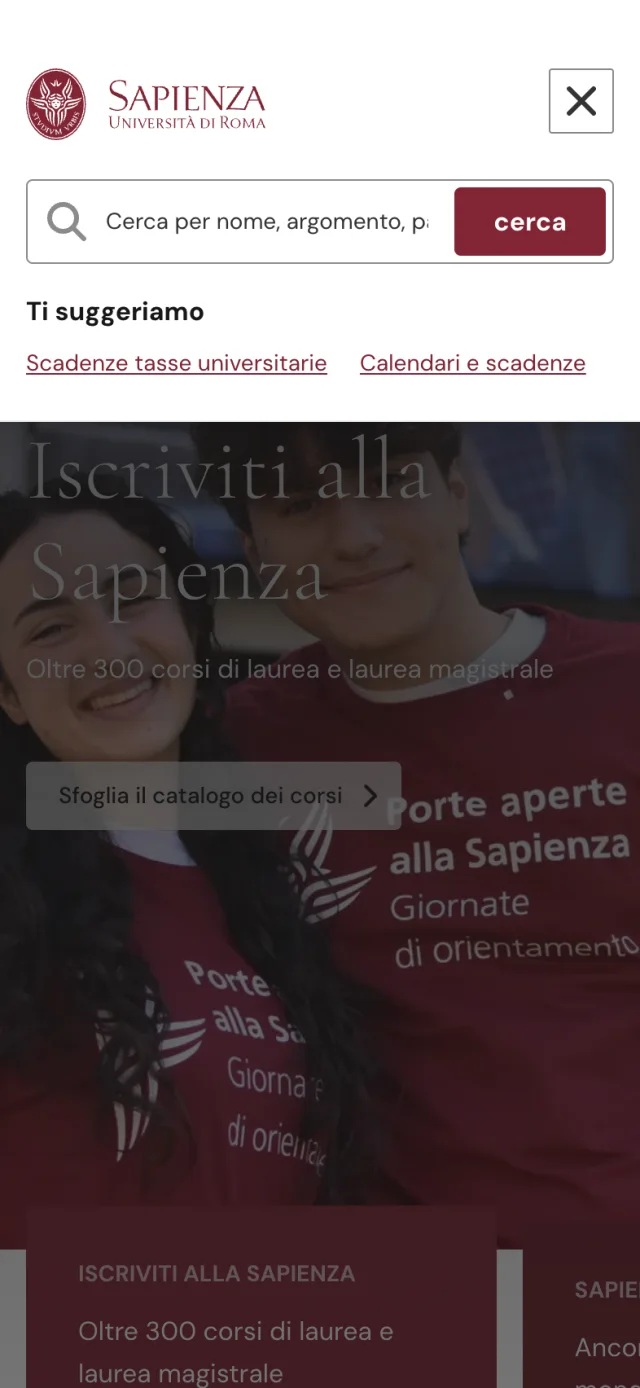
Home · three-level menu · search overlay
Underneath the page, the content model stays in Drupal and builds on the modular architecture already available in the CMS: the content types and Paragraphs dedicated to composing the homepage are where the editorial team decides, with full flexibility, what to feature, reorder or replace.
The front end was rebuilt from scratch as a Next and React application that consumes that content and presents it according to the rules of the design system. The foundations do not stay a document: they become the behavior of the page.

The project came out of integrated work between the university and SparkFabrik, with no intermediaries: from audience analysis to the delivery of the foundations.
The vision
The homepage is the first application. The foundations remain: documented, shared, ready for every next page of the future university website.
−70% in content publishing time
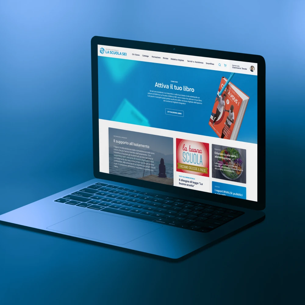
30 countries and about twenty languages on one platform
Services
Resources