Il Giornale - Sfogliatore

The new app to browse the newspaper digitally
Project
Il Giornale - Sfogliatore
Technologies
react icon aws icon

The client

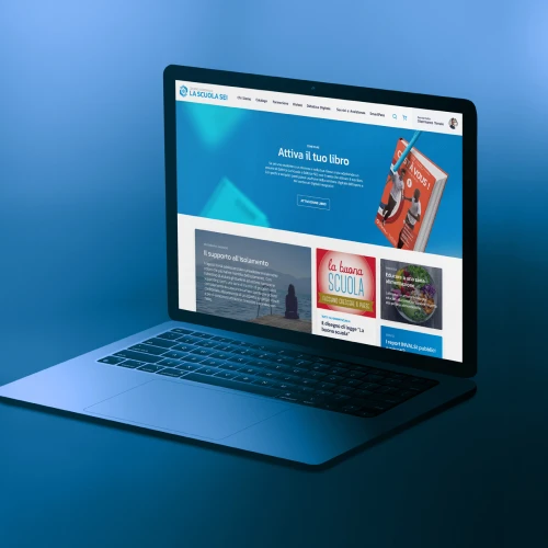
Il Giornale is a national daily newspaper based in Milan, founded by Indro Montanelli in 1974, and among the most widely circulated news papers in Italy.

Il Giornale logo

The objective

The client's request was for a complete makeover of the look & feel, and the design of a new user experience for reading the online newspaper that would be multi-platform, both via mobile app and browser-based web app, and that would respond to the brand identity and values of the newspaper In addition, a new workflow was also required for the digital copy of the newspaper and the subscriber copy, to have everything managed by the editorial staff in a centralised and integrated manner.

Business and internal management objectives had to be achieved in a context with three different codebases, one for each platform (web, iOS and Android), and the consequent difficulty of making corrective and evolutionary interventions.

The challenge

The challenge in this project was twofold: the user experience and design of a new concept for loyal readers on the one hand, and the editorial requirements of back-office users on the other.

In the first analysis phase, aimed at highlighting the primary customer needs, it quickly became evident that the first design pillar was to ensure a smooth cross-platform experience. We wanted to create a product that had unambiguous navigation patterns.

Experience
Cross-platform
Navigation
Unique Patterns
Image of the foundations of the design of the new app
Only a layout with strong and consistent design foundations would make it possible, for example, to start reading on a laptop screen, continue it on an Android smartphone at work and, perhaps at the end of the day, finish it on an iPad, while maintaining the user's subscription and settings.

The UX had to allow a seamless transition from one device to another, while maintaining the same perception of the reading experience.
Furthermore, a second element of the design strategy was to maintain the user base: subscribers who had been using the old apps up to that point were to be provided with an easy and intuitive navigation flow to take their subscription to the new apps in just a few steps.

Best practices and design principles for building an enhanced mobile user experience were followed. The identified concept design, modern and clean, made the reading experience more immersive.

Among the new functions available identified by the UX analysis:

  • 1

    Reading articles in text mode and not just PDF

  • 2

    Saving individual articles to favourites

  • 3

    Search within the archive and individual issues

  • 4

    Access to issues history (from 2015)

  • 5

    Customisation of reading options (font, line spacing, font size)

  • 6

    Resting your eyes thanks to the night reading mode

  • 7

    Reading of editions already consulted on the app in offline mode

Il Giornale Dashboard
Studying the needs of internal back office users led to the design of a single dashboard to manage the progress of a digital copy entered into the system, published and then sent to the apps, as well as managing the subscriptions of all users from any platform. A system for reporting and exporting data was another piece of evidence that emerged.

In synergy with the customer, overcoming the problems related to competing codebases was possible. Besides this, the centralisation of the three different platforms for subscription management (the web ecommerce and those of the two mobile stores Google and Apple) was also a success factor.

In addition, we proposed a general increase in the security of each infrastructure element, right down to the protection of the individual assets that make up a digital newspaper edition accessible only to subscribers.

The method

We started with a series of methodological milestones typical of our projects: a needs assessment phase, analysis of the insights gathered so far, benchmarking of competitors and cases with the exact user needs, albeit in different fields.

It then became clear that the concept design, more modern and closer to the redesign of the ilgiornale.it website, had to simultaneously recall the experience of consulting the digitized paper newspaper.

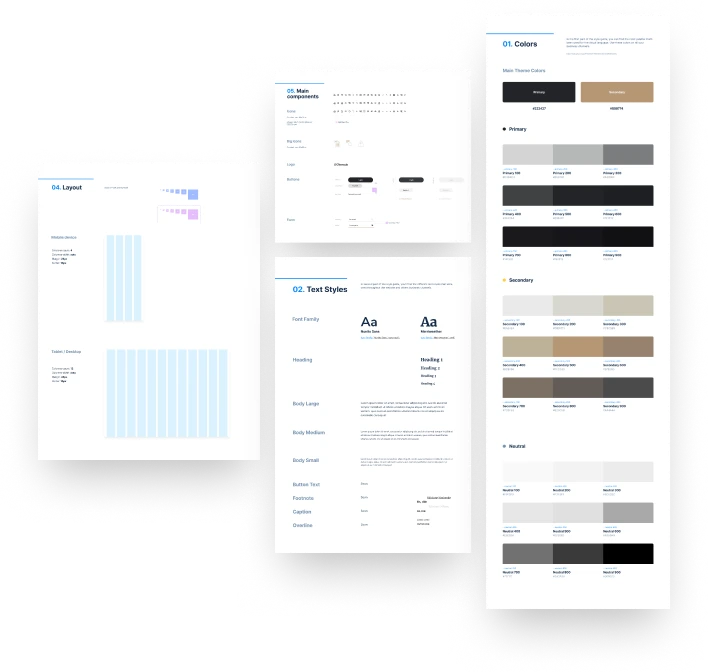
a design system leading towards a unique look&feel in line with the brand

The design of the implementation architecture proposed an integrated, cloud-native solution based on a single codebase for the web and mobile versions of the apps, with an equal look and feel on each device and centralized management of accounts, analytics and payments.

The choice of the React Native framework, one of the most popular frameworks for mobile development, created and supported by Meta and widely maintained by companies and the community, allowed us to quickly arrive at a prototype with a digital copy, and to gradually proceed with the new functionalities.

The new mobile and web application offers subscribers an experience that is faithful, in content and layout, to the printed copy, but which benefits from all the potential of digital to offer a modern tool, starting with the in-app purchase payment system, centralized login, personalisation of the reading experience, full-text search, archive with downloaded copies for offline consultation, and the latest news from the web editorial office.
Il Giornale React
Il Giornale React
React Native allowed us to maintain the three versions of the app on a single codebase, thus greatly facilitating maintenance, updates, and future cost containment. The implementation of new features does not have to follow separate designs and flows for the three targets; the team of developers can work on a single product, and the testing and delivery automation then allow a new version to be quickly delivered to the staging channels visible to the client, who can then approve and discuss the solutions before they are published to all users.
After analyzing market proposals for cross-platform payment management, we decided to implement a custom solution based on the in-app payment SDKs of the two mobile stores, but centralized on the customer's servers so that a subscription activated on one platform is also perfectly valid on the others.

On the back office side, we conducted an analysis of the backend platform in charge of importing digital copies, and of the management of user subscriptions, divided among the three platforms. In synergy with the client, we designed a new architecture. We proposed a totally cloud-native solution, with a new definition of the serverless infrastructure on AWS, database management and implementing a new dashboard for editing.

The results

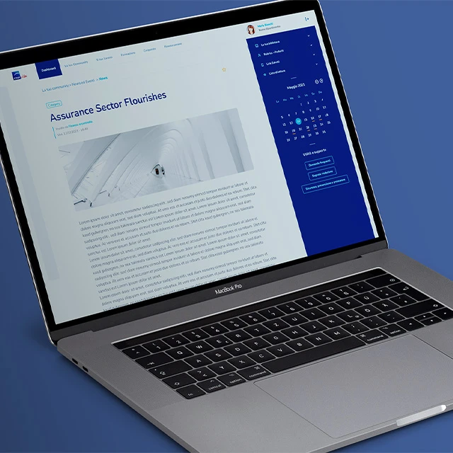
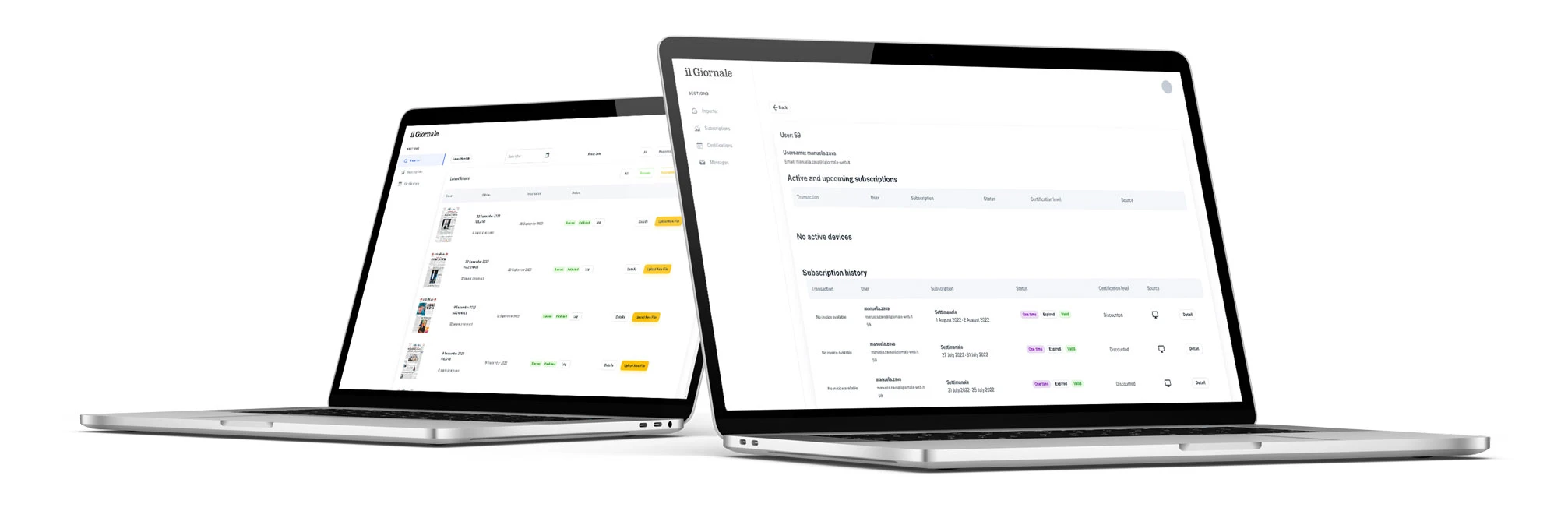
We published the new version of the mobile apps simultaneously on the Android and iOS stores, informing the user base to upgrade if automatic updates were disabled. At the same time, we published the new web version, immediately accessible to all subscribers.

The result for users has been a painless transition to the new apps, which offer a smooth and consistent user experience on all devices, many new features that are immediately appreciated, and a product that is now modern and in line with the new mobile operating system standards on UI, privacy, and in-app payments.

For the editorial staff, the new backoffice provides an overview of the status of the apps in one dashboard, from the daily digital copies from the press streams and published no earlier than the appointed time for all users, to the finally centralised management of subscriptions, with the possibility to intervene also on extensions, renewals, coupons and manual creation.

Finally, for the development and maintenance team, an ease of intervention on the unique application code allowed them to analyse new requests and plan the release of new features.

Get in touch

Follow us on social media
Listen to Continuous Delivery