
A brand’s digital presence is no longer limited to a website or an app: every user experience spans different channels, different devices and ever-evolving contexts of use. From smartphones to smart TVs, from mobile apps to wearables, users expect consistency, fluidity and accessibility at every touchpoint.
Without a shared system, the risk is creating inconsistent interfaces, redundant processes and a fragmented experience that is difficult for teams to manage and unintuitive for people.
A design system exists precisely for this reason: to bring order, ensure consistency, optimize workflows and improve the experience, both within and beyond teams.
In this guide, we will look at how to build one, evolve it over time and integrate accessibility criteria from the very start — not as a constraint, but as added value.
You will find key principles, practical examples and strategies for evolving your design system in a continuous and collaborative way. Whether you need to create one from scratch or improve what you already have, you are in the right place.
What is a design system and why is it the pillar of your digital strategy
An integral part of a UX Strategy , a design system is a structured set of guidelines , components, shared assets, documentation and code used to design and develop (and subsequently maintain) digital products in a consistent, scalable and inclusive way. Think of it as a living set of shared rules, stylistic choices, patterns and code that helps teams design and develop in a consistent, scalable and accessible manner.
Compared to a style guide or a pattern library, a design system goes deeper: it accompanies the entire product lifecycle , from wireframe to deployment. And when well thought out, it plants the seeds of accessibility from the earliest design phases, translating them into interfaces that are inclusive by design and by default, exactly as required by the European Accessibility Act.
But it is not just a matter of compliance: a design system is also a collaboration tool and a long-term business asset . It helps teams speak the same language, work more fluidly and share reusable solutions without duplicating effort. It reduces technical debt and makes it easier for different roles to work together: designers, developers, QA, content specialists.
Adopting and evolving your design system: a path towards continuous improvement
A design system is not designed once and then shelved. It is a living ecosystem. For many organizations, the first step is not starting from scratch, but building on what already exists : a Figma library, an incomplete style guide, a partial set of components. A design system often starts this way, from an imperfect foundation that takes shape over time, as roles, processes and responsibilities become clearer.
Adoption strategies
There is no single way to have a design system: you can adopt an existing one, adapt one to your needs or design one from scratch . In any case, a good design system is never static : it grows with projects, evolves with technologies and is nourished by the contributions of those who use it. Its value lies precisely in this: holding together aesthetics, technology and inclusion, turning every vision into concrete practice.
A well-adopted design system is not only documented: it is understood and used by those working on different projects, at different times. That is why it is worth starting small , with an initial version composed of a core set of essential, high-impact components for the user experience (e.g. buttons, forms, typography), shared across a few teams. From there, you can then scale gradually , collecting feedback, adjusting guidelines and creating practical use cases.
The golden rule : better to have less that is used well, than everything at once and forgotten. Even the most technically elegant design system fails if it is not actually adopted by the organization. A pragmatic and incremental approach allows you to deliver value quickly, encourage internal adoption and validate successive choices and evolutions based on real feedback.
Every new feature is an opportunity to improve the system. Every project can become a test to verify its robustness. Every team request is a useful signal to understand whether something needs updating, adding or simplifying.
Governance: clarity first
A system grows well if it has clear governance. Who can update the system? How are new solutions proposed? Who decides in the case of exceptions? Defining roles and processes prevents chaos and makes the system more stable over time, even when projects and teams change.
A component’s ability to endure and adapt lies in its governance, not in its supposed initial perfection. A well-governed component can evolve over time; a component that is excellent today but ungoverned is destined to become obsolete and a source of inconsistency in the future.
Team culture: this is where a design system grows in a healthy way
No design system truly works if it is not supported by team culture. It requires collaboration between design and development, between UX and content, between those who design and those who test . It requires continuous training, opportunities for discussion and spaces where the system is communicated, updated and understood. A shared, maintained and living system is also the one that can most easily integrate fundamental aspects over time, such as accessibility, efficiency and innovation.
This is why it is never a job that is finished once and for all. It is a continuous process of improvement, listening and collaboration. Every new feature, every piece of feedback received, every bug fixed can become an opportunity to evolve.
Design system and the European Accessibility Act: how to turn obligation into opportunity
If until recently a well-structured design system was the foundation for consistent and scalable digital products , today it is also something more: it is a strategic tool for complying with the European Accessibility Act.
Indeed, since 28 June 2025, accessibility is no longer just a best practice, but a regulatory requirement for companies operating in the European market, as established by EU Directive 2019/882 , better known as the European Accessibility Act (EAA) .
The objective is clear: to make digital products and services — such as e-commerce sites, apps, platforms or software, as well as downloadable documents like PDFs and presentations — genuinely usable by all people, including those with disabilities.
The technical reference standard is EN 301 549 , which requires conformity with WCAG 2.1 Level AA . The obligation applies to both new and existing products. Only micro-enterprises and cases where compliance would be disproportionate to available resources are exempt.
And this is where the design system comes into play. Why wait until the last moment to “fix” a website or an app when you can build a system that integrates accessibility from the very beginning — in the design, in the code, in the content? An accessible design system is the tool that allows you to do this because it documents components, patterns and best practices. And one more thing: it will be the single point of reference for the entire team right from the start, but also for the future as the product evolves.
When well structured, a design system helps you to:
- comply with regulations;
- ensure consistency and conformity across the entire product;
- make teamwork simpler;
- improve the user experience for all people, not just those with a recognized disability.
It is a matter of compliance, certainly. But it is also an opportunity to do better and engage an audience segment that often remains invisible.
That is why we have created specific resources to accompany you on this journey: a white paper on the Accessibility Act and the design system that explores strategies and methodologies in depth, and an operational accessibility compendium with checklists and practical tools to prepare for the change.
The concrete benefits of a design system
Building better, more robust and more competitive products? It all starts with a good design system: the most effective way to turn this vision into daily practice.
The concrete advantages
- Consistency across every touchpoint A design system helps create a uniform visual and behavioral identity. Components, interactions, tones and patterns speak the same language, from website to app, from e-commerce to chatbot. The result? A recognizable, fluid and reliable experience.
- More speed, less duplicated work Ready-made patterns, components and guidelines mean less time spent reinventing and more time for innovation. Teams can focus on solutions, not on repetitive details. This accelerates development cycles, reduces errors and increases scalability, while also facilitating and reducing maintenance costs.
- Collaboration and alignment across teams A design system enables the alignment of cross-functional teams. It creates a “unified language” that reduces communication, design and development errors. This is a truly valued advantage when teams become geographically distributed, and it also facilitates the onboarding of new team members.
- Less technical debt, more quality Thanks to a design system, it is possible to modify components and propagate updates to all instances that use them. This reduces bugs and inconsistencies, simplifies maintenance and improves overall quality. And when accessibility is built into the components, it contributes to the accessibility of your entire digital ecosystem.
- A UX that works for more people Accessible does not just mean for those with a recognized disability. It means designing for the greatest possible number of people: those browsing on mobile, those with a slow connection, those using only the keyboard, or those in a temporarily disadvantaged situation — such as sun glare on the screen or a broken arm.
- Inclusivity that opens new markets Over 20% of people in Europe live with a disability. But inclusivity is not just an ethical issue: it is a strategic choice that broadens the user base and strengthens brand positioning.
- Stronger brand + more solid reputation = competitive advantage A design system also becomes an asset for strengthening the brand, improving recognizability, establishing consistency in the experience, contributing to the perception of professionalism, creating value and long-term competitive advantage. Furthermore, being accessible means being reliable, forward-thinking and attentive to people: an inclusive design system thus becomes a communication asset as well.
Why you (might) think you don’t need a design system
Does creating a design system seem like too big a project? Too rigid? Not suited to your organization? It is a common thought. Many teams get stuck before they even start: they fear it is only for big tech companies, or that it will slow down creative processes.
In reality, a good design system adapts to its context : it can start small, grow with projects and evolve based on needs. This is also confirmed by insights from Figma and Nielsen Norman Group — there is no single way to adopt and implement it. You can start with little, test, evolve. What matters is building a shared foundation.
Components and fundamental principles of a design system
Beyond principles and strategies, a design system rests on a concrete foundation: its components . These are the fundamental building blocks with which we create consistent and scalable interfaces. We are not just talking about buttons or form fields, but complete modular blocks with logic, style and behavior, ready to be reused. Alongside them are patterns , recurring combinations of components that solve specific problems (for example, an advanced search module or an e-commerce shopping cart), and templates , which give shape to complete pages or flows.
To organize and maintain all of this, two key tools are used: the component library , which describes individual elements and their variants, and the pattern library , which explains how to combine them in different contexts. This is where the bridge between design and development, between interface and code, is built. Many teams choose to structure their systems according to the atomic design approach, starting from basic elements (atoms) such as buttons and labels, aggregating them into more complex molecules and organisms until they create templates and pages. This helps maintain scalability and order even as the system grows.
Another crucial piece of the puzzle are design tokens : abstract values for colors, spacing, typography and other styles. They are the glue that allows design choices to be applied consistently and updated across all platforms without rewriting code each time. In fact, by modifying a value just once, it is possible to automatically propagate updates to all components that use that token, enabling scalability and eliminating inconsistencies.
But having libraries and tokens is not enough. To truly work, every component must be well documented : what it does, how it behaves in different states (hover, focus, disabled), how it adapts to various breakpoints and what accessibility rules it follows. This documentation is the compass that guides content designers, UX and UI designers, developers and QA, making work faster and more precise.
It therefore becomes clear why we emphasize that a good design system is not just a static repository, but a strategic infrastructure that integrates components, patterns and governance to support teams over time, ensuring consistency and innovation. And this is where the space opens up for new challenges and opportunities.
What makes a design system accessible
As we have seen, accessibility can now be considered a new foundational principle of a design system. To be truly accessible, a design system must consider from the very start:
- adequate color contrast , at least 4.5:1 for normal text, paying attention also to states such as hover, focus and active;
- readable typography , with clear fonts, accessible sizes and generous line height;
- visible focus , the user must always know where they are when navigating by keyboard;
- text alternatives , to provide the ability to interpret every meaningful image;
- clear and stable form labels , never replaced by placeholders;
- responsive and flexible layouts , usable even on small screens or with magnification;
- semantic code , with native and well-structured HTML tags, to help screen readers interpret the page.
All these elements are mapped to WCAG 2.1 AA criteria and described in a practical way in our white paper and in our operational guide for accessibility according to the European Accessibility Act (EAA).
Designing with accessibility in mind
To make accessibility an organic part of the design system, you need to start right away: already in Figma, components should be annotated with the relevant WCAG requirements. This helps those who design and develop to keep an eye on accessibility, usability and consistency from the earliest stages.
But inserting technical rules is not enough: what is needed is an approach guided by inclusive design principles , which place at the center the needs of the greatest possible number of people, not only those with recognized disabilities.
UX developer as a key role
The bridge between design and code is fundamental. This is where the UX developer role comes into play — a key role for transforming components created in Figma into real, accessible and maintainable elements over time.
The UX developer works side by side with UX designers, UI designers and front-end developers to:
- implement accessible components according to WCAG standards;
- validate focus, ARIA roles and semantic structure;
- clearly document how a component is used and what accessible features it contains.
Well-crafted documentation allows anyone — designer, developer or QA — to reuse components with awareness and continuity, avoiding errors and inconsistencies.
READ ALSO: UX Developer: who they are and what they do
Design system and Drupal: consistency and accessibility even on complex platforms
A well-structured design system also finds fertile ground in enterprise CMS platforms like Drupal. In these contexts, the architectural complexity and content modularity can pose challenges for visual and functional consistency. Integrating a design system into a Drupal ecosystem instead enables maintaining uniformity across components, patterns and layout logic, reducing inconsistencies between front-end and back-end.
But it is not just a matter of visual order. Thanks to the adoption of accessible and documented components, the design system also facilitates the creation of Drupal themes that comply with WCAG 2.1 AA, simplifying compliance with the European Accessibility Act.
In particular, through dedicated tools such as Figma, Storybook and ZeroHeight (as well as through the mapping between design components and Twig templates, Drupal’s templating engine), it is possible to create a solid and traceable flow between design and development. This translates into greater efficiency, less technical debt and a consistent UX, even on complex and multi-site platforms.
READ ALSO: Design System and Drupal CMS: the link between designers and developers
AI tools for the design system: smart support for efficiency and accessibility
Artificial intelligence can offer concrete support in the creation and management of an accessible design system. It is not about automating the entire process — which remains profoundly human — but about integrating tools capable of simplifying, verifying and optimizing.
Today, AI tools exist that help to:
- perform rapid accessibility checks , such as color contrast, the presence of alt text or text readability;
- suggest more inclusive variants of existing components , evaluating criteria such as clarity, font size or keyboard interaction;
- detect inconsistencies in the design system , analyzing visual or behavioral patterns that do not follow shared standards;
- streamline cross-functional workflows , suggesting consistent naming, generating baseline documentation or automating synchronization between design and development.
A key point for us: AI can simplify, speed up and suggest, but it cannot fully replace the work of those who design, test and maintain a system . Decisions must remain conscious, and manual testing — including testing with people with disabilities — is irreplaceable. As already highlighted in our white paper on the EAA and design systems, AI tools (including widgets) are valuable instruments, but they must be embedded within a solid and well-governed design process. Therefore, AI tools are useful allies, but the responsibility remains in the processes, in the teams and in shared decisions.
When the design system works: examples of success
At SparkFabrik, we support enterprise organizations in developing or evolving their own design systems, tackling challenges of consistency, scalability and accessibility in complex digital contexts.
Among our case studies are projects where the design system served as the lever for unifying the user experience across multiple platforms, drastically reducing development time and costs and maximizing brand consistency. Structured companies, including those operating on an international scale, have achieved greater efficiency, stronger governance of brand identity and shared documentation that simplifies the onboarding of new team members.
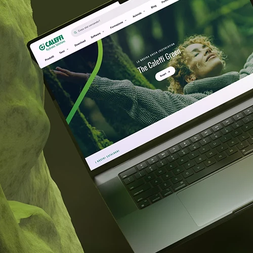
- Take, for example, Caleffi : a multinational for which we developed and evolved an extensive design system, capable of covering every need, from atomic elements to complex templates. The result? Brand consistency guaranteed across an articulated ecosystem consisting of 12 catalogs, over 20,000 listed products, more than 5,000 technical files, a presence in 12 countries and 18 languages, and approximately 8,000 daily page views.
- For Bocconi , the new design system involved many stakeholders and led to the creation of a shared set of guidelines. The most appreciated result is documentation accessible to both development and editorial teams — an element that facilitates governance and ensures continuity in content production among people with different roles and distinct university departments.
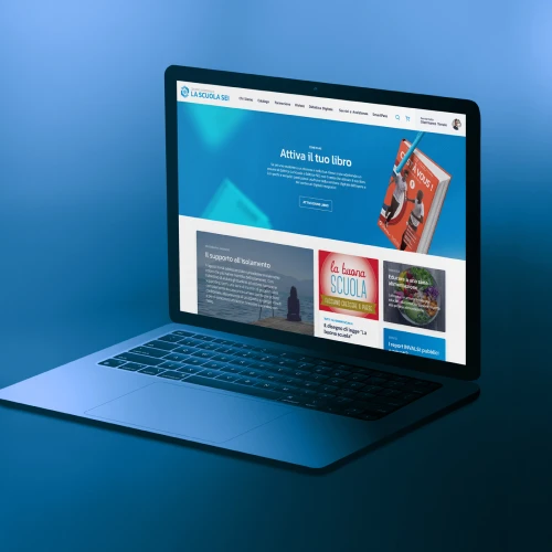
- Another significant experience is the project carried out for La Scuola , where we followed the entire process of redefining the brand identity. The work started from an initial assessment and concluded with the final release. The full correspondence between the design system and the CMS editorial tools enabled simple and fast onboarding for all new editors.
- Finally, for Zambon we built a navigable system using Fractal, which allows all layout and interaction elements to be viewed immediately. The site is fully shareable, with reading levels designed for both technical and non-technical stakeholders, and enables effective and inclusive communication across all business areas.
The design system that grows with you
Every design system is unique, because the context in which it is born is unique: priorities, constraints, people, objectives.
At SparkFabrik, we start from here, helping you gain clarity on what you already have, what you need and how to build (or evolve) a system that truly works, within and beyond your teams. We work alongside you to define governance, tools, processes and components, with an approach that holds together accessibility, efficiency and sustainability over time. Our goal is to deliver a design system that does not remain on paper, but becomes part of your teams’ daily work and brings real value to your digital projects.


